Client: More Polish Pottery


Project: Brand Identity, Style Guide


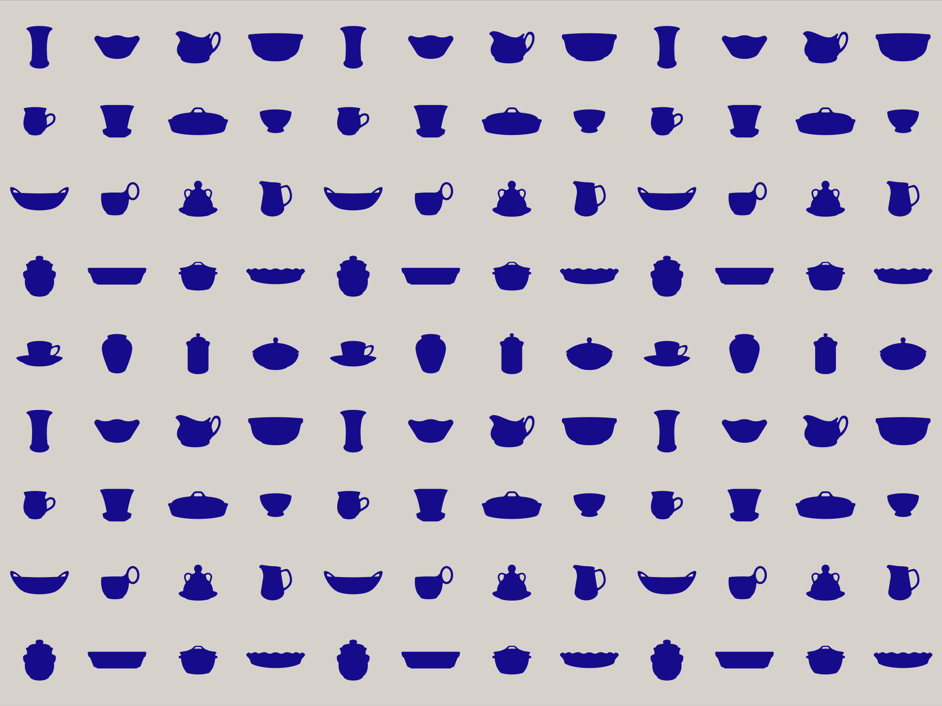
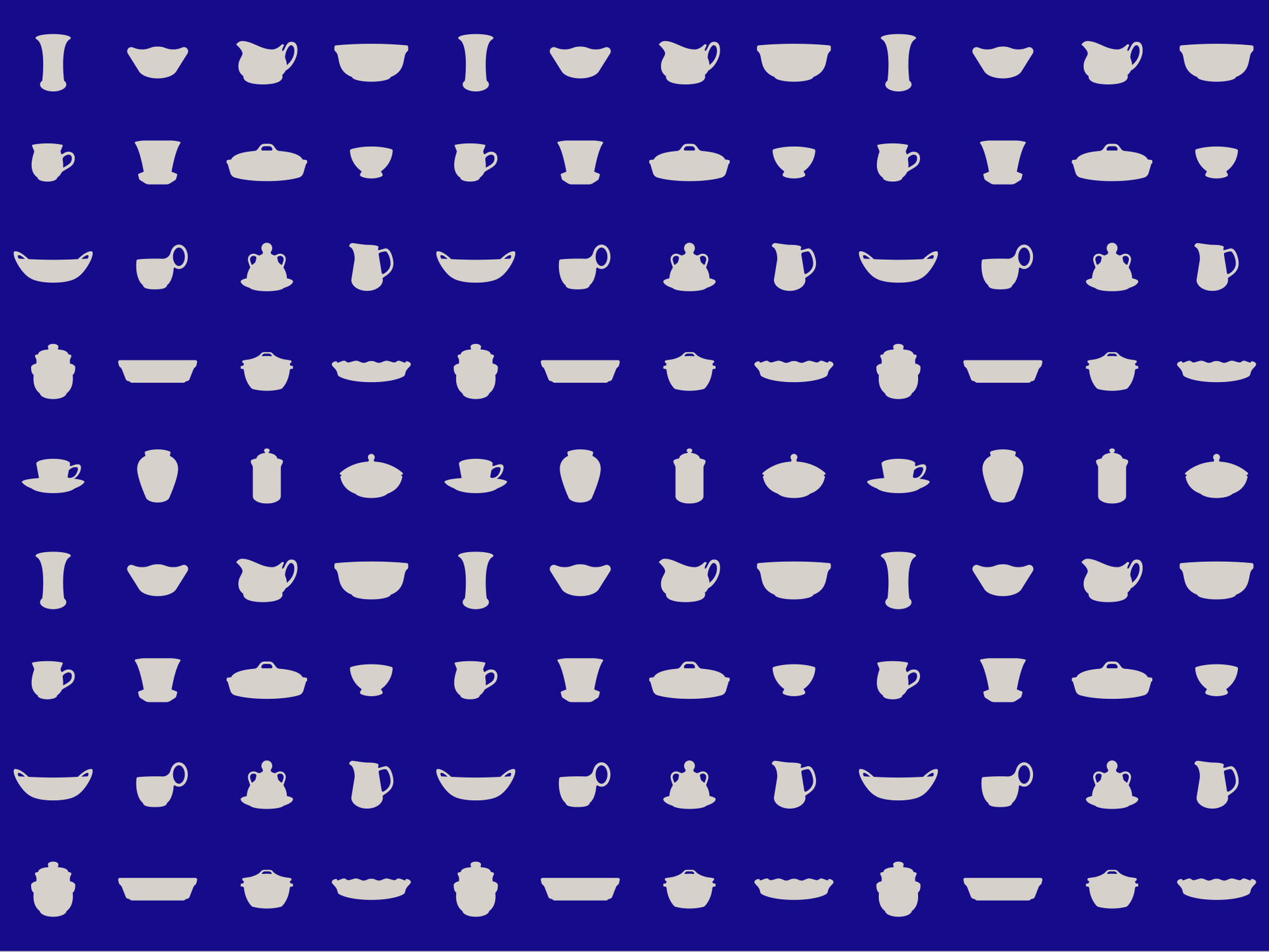
For their 10th year anniversary, More Polish Pottery wanted to refresh their brand identity. They needed a look and feel that represents the high quality Polish Pottery products they import and sell. This new look is fresh, modern, clean and takes the brand to the next level as the leader in imported Polish Pottery and goods. The pattern showcases a number of the beautiful pieces that they sell and can be used for multiple purposes throughout the brand.

Brand Identity

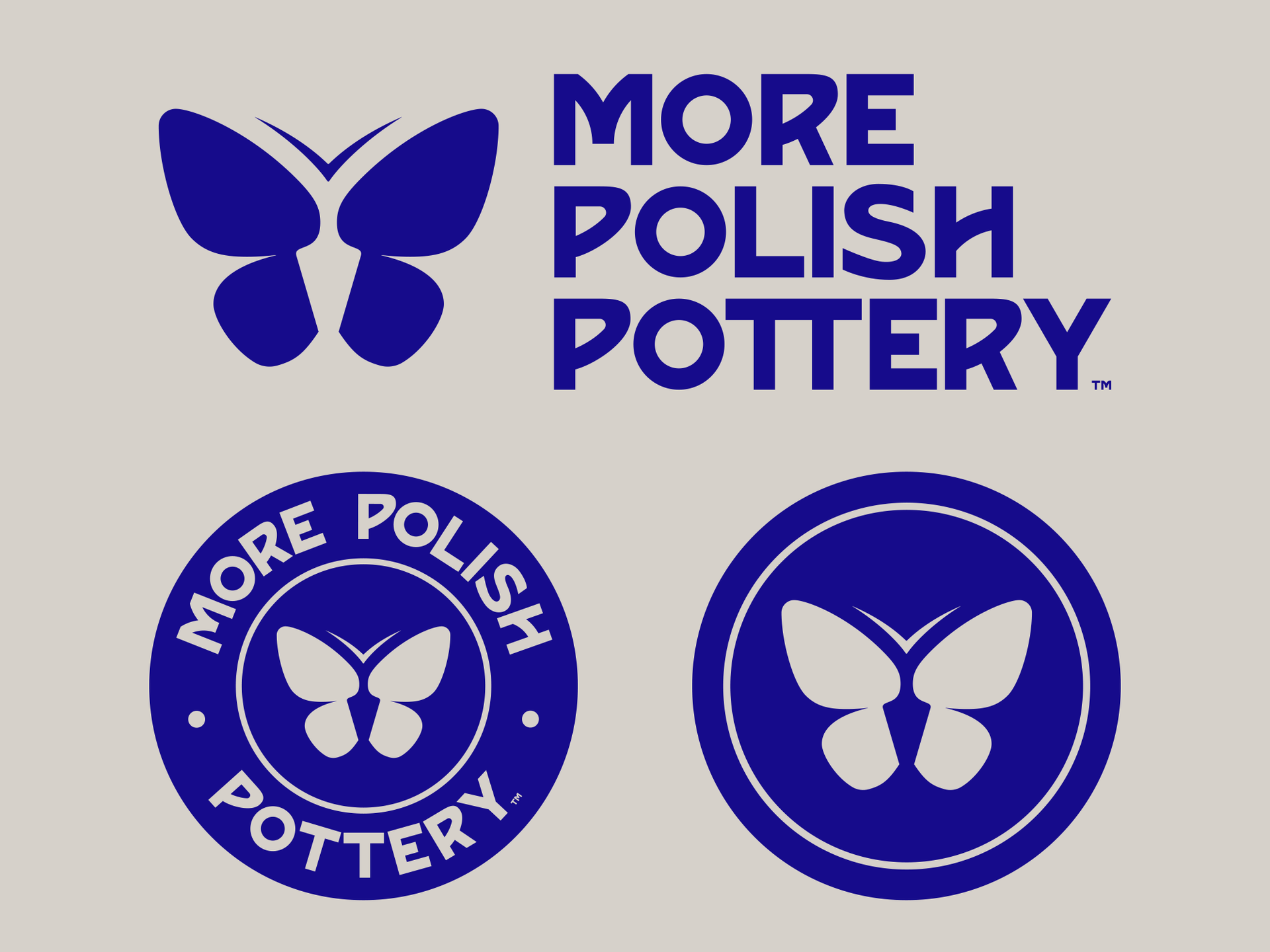
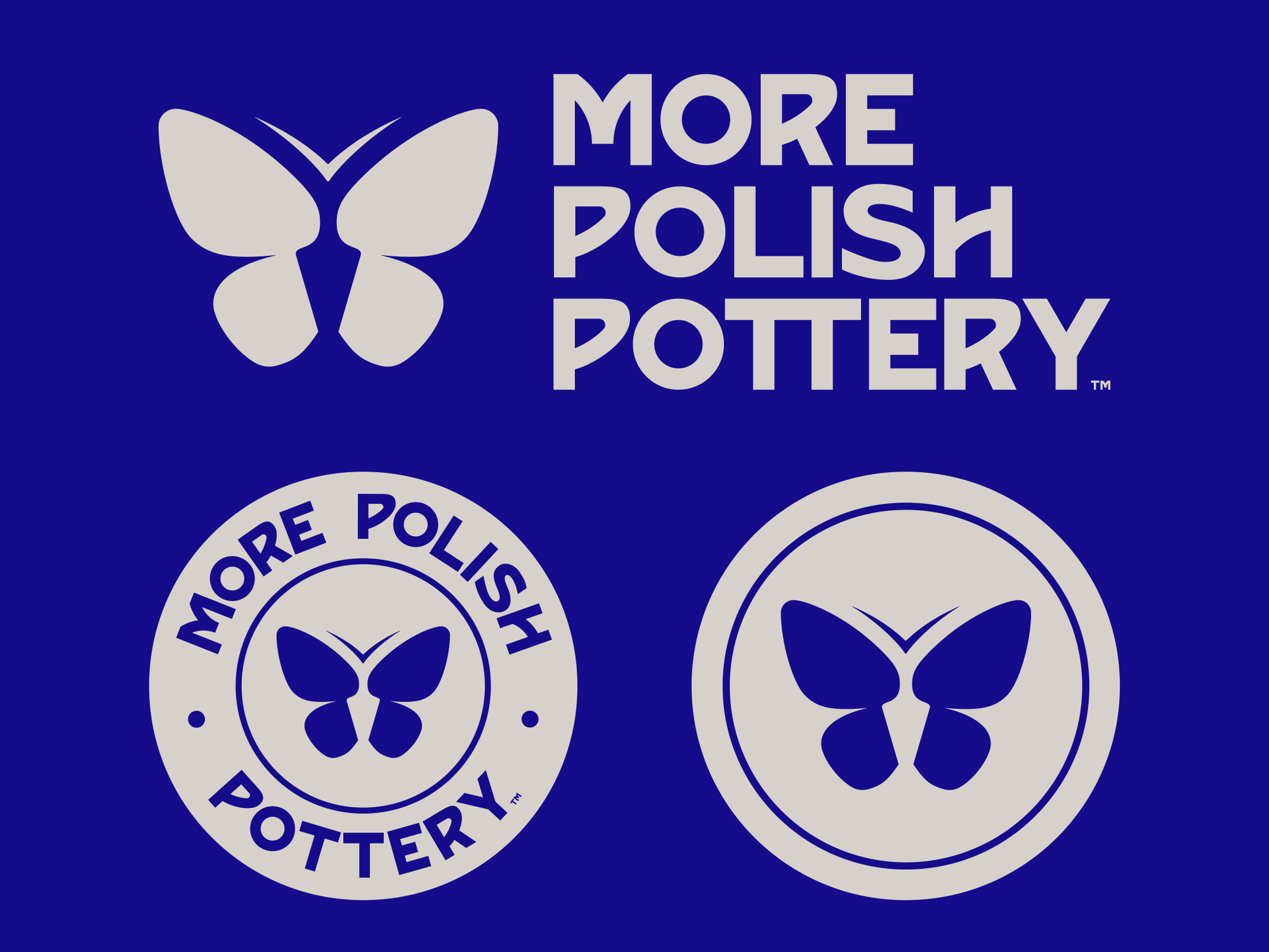
Blue butterfly logo and “MORE POLISH POTTERY” text shown in three variations.
Blue “More Polish Pottery” logo with butterfly icons on a white and blue background

Brand Icon Set

Abstract pattern of small dark blue shapes arranged in a grid on a light beige background for More Polish Pottery
Blue background with a repeating grid of small white cup-like icons and dots

Packaging

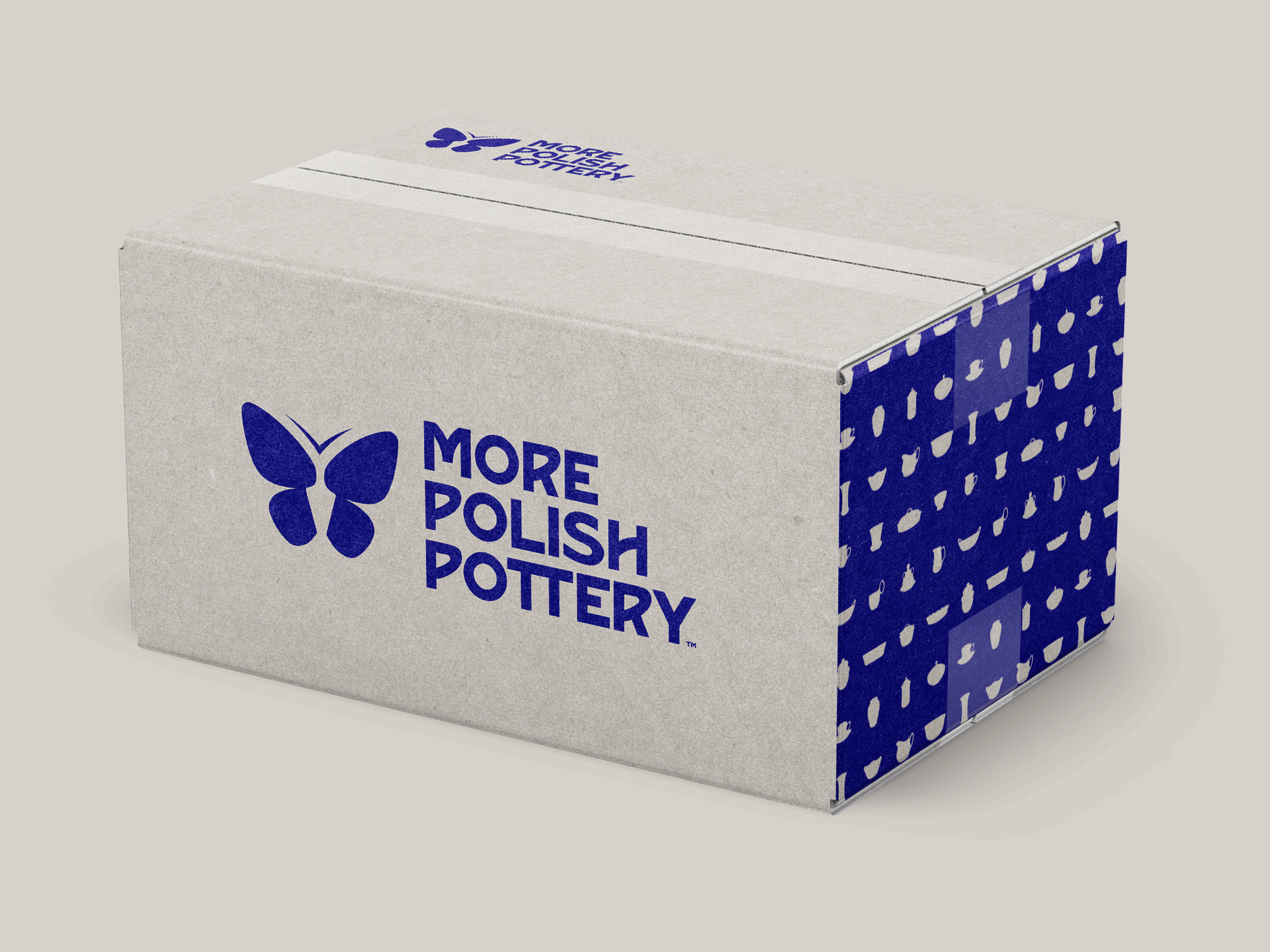
Blue and white More Polish Pottery branded packaging with butterfly logo on a plain background
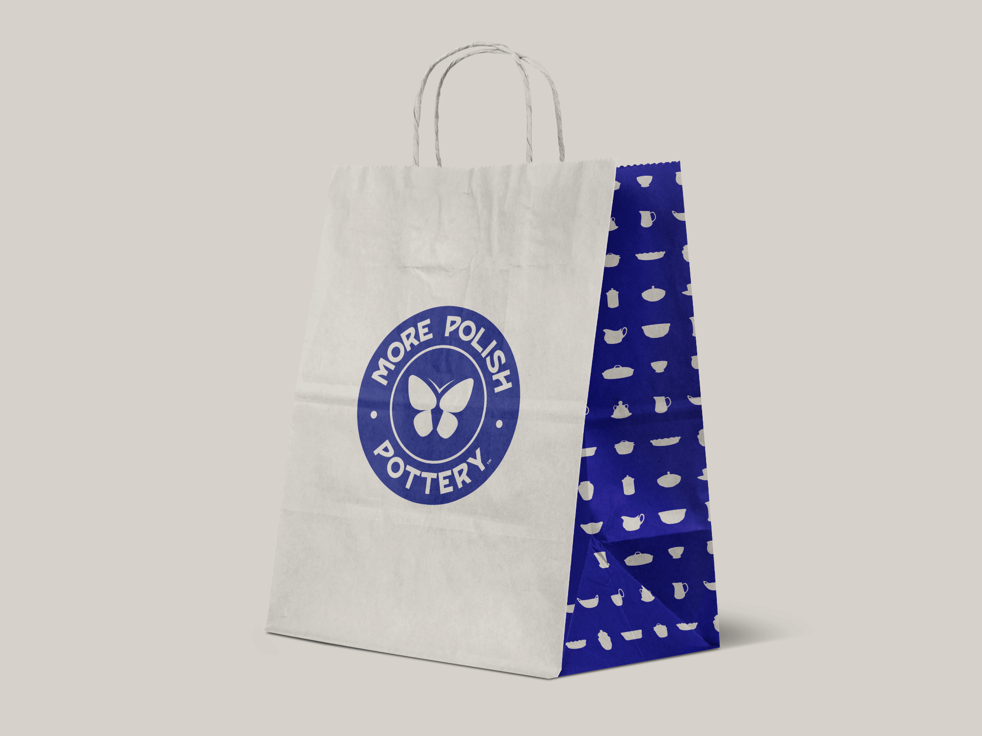
White tote bag with blue “More Polish Pottery” logo and patterned blue side panel on a light background

Signage

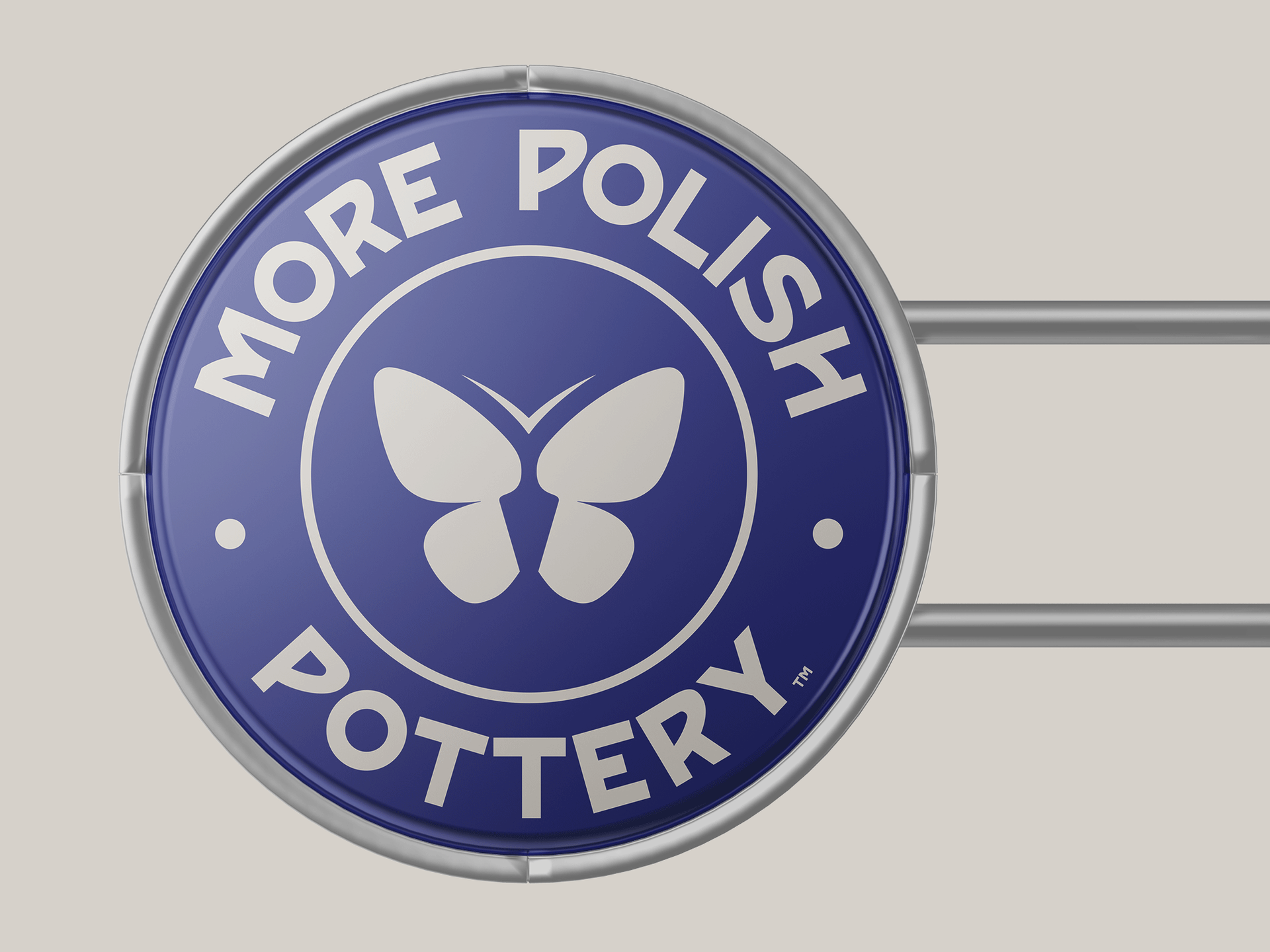
Blue circular “More Polish Pottery” logo with a white butterfly icon.