Client: RJ Oneil
Project:
Brand Identity, Brand Strategy, Icons, Brochure, Vehicles, Website
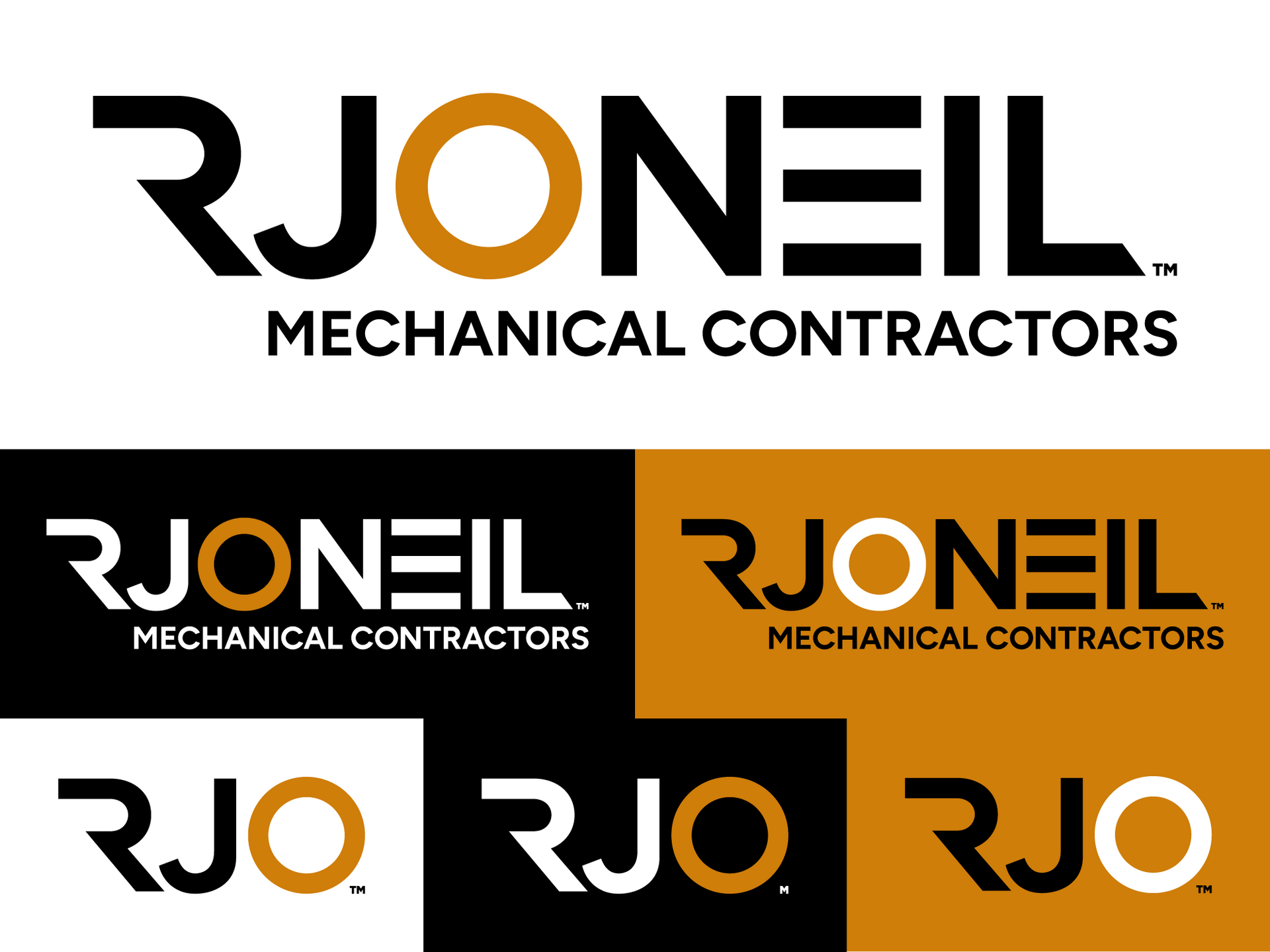
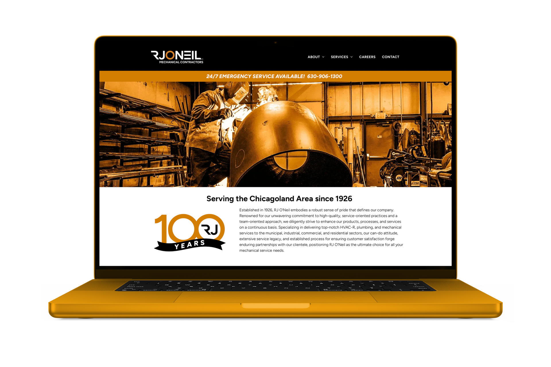
We're honored to have partnered with RJ O'Neil during one of the most significant milestones in the company's history—their 100th anniversary. They came to us looking for more than just a new logo. They wanted a modern, recognizable brand that reflected the trust they'd built over the past century and elevated their image to match the exceptional level of service they provide every day.
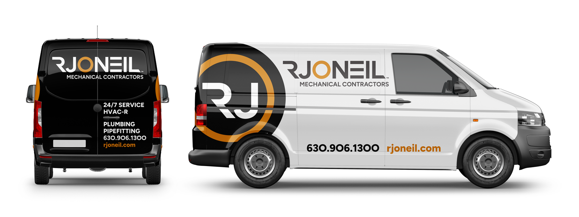
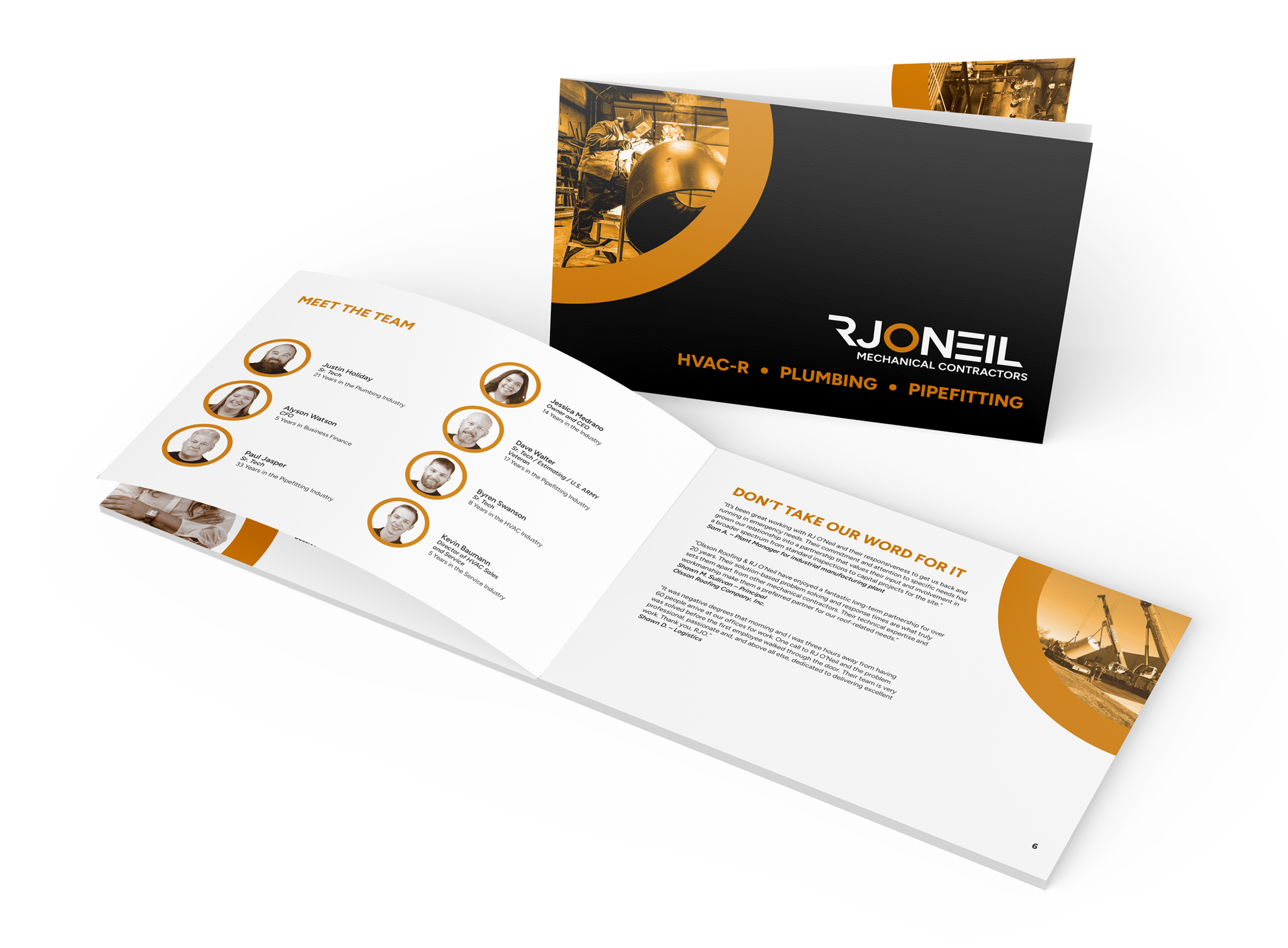
The rebrand touched nearly every aspect of the business. From apparel and stationery to fleet graphics, signage, marketing materials, and even the colors on the office walls, every detail was thoughtfully redesigned to create a cohesive brand experience. The result is a stronger, more recognizable identity that reinforces RJ O'Neil's position as a trusted leader in the industry.