Client: Wing it On


Project: Brand Identity, Product Branding 


Wing it on, a chain of 13 restaurants, proudly holds the coveted title of being the nation's Buffalo Sauce champion. The veracity of this claim is undeniable, and their culinary offerings are nothing short of extraordinary (you can take our word for it!). With aspirations of expansion and franchising, they were seeing a new, more versatile brand look and feel. Amidst a competitive arena filled with countless wing establishments, our task was clear: to bestow these spirited contenders with a revitalized and audacious persona. Because, let's be honest, when you reign supreme in the realm of poultry, your confidence should be unmistakably showcased.

Brand Marks

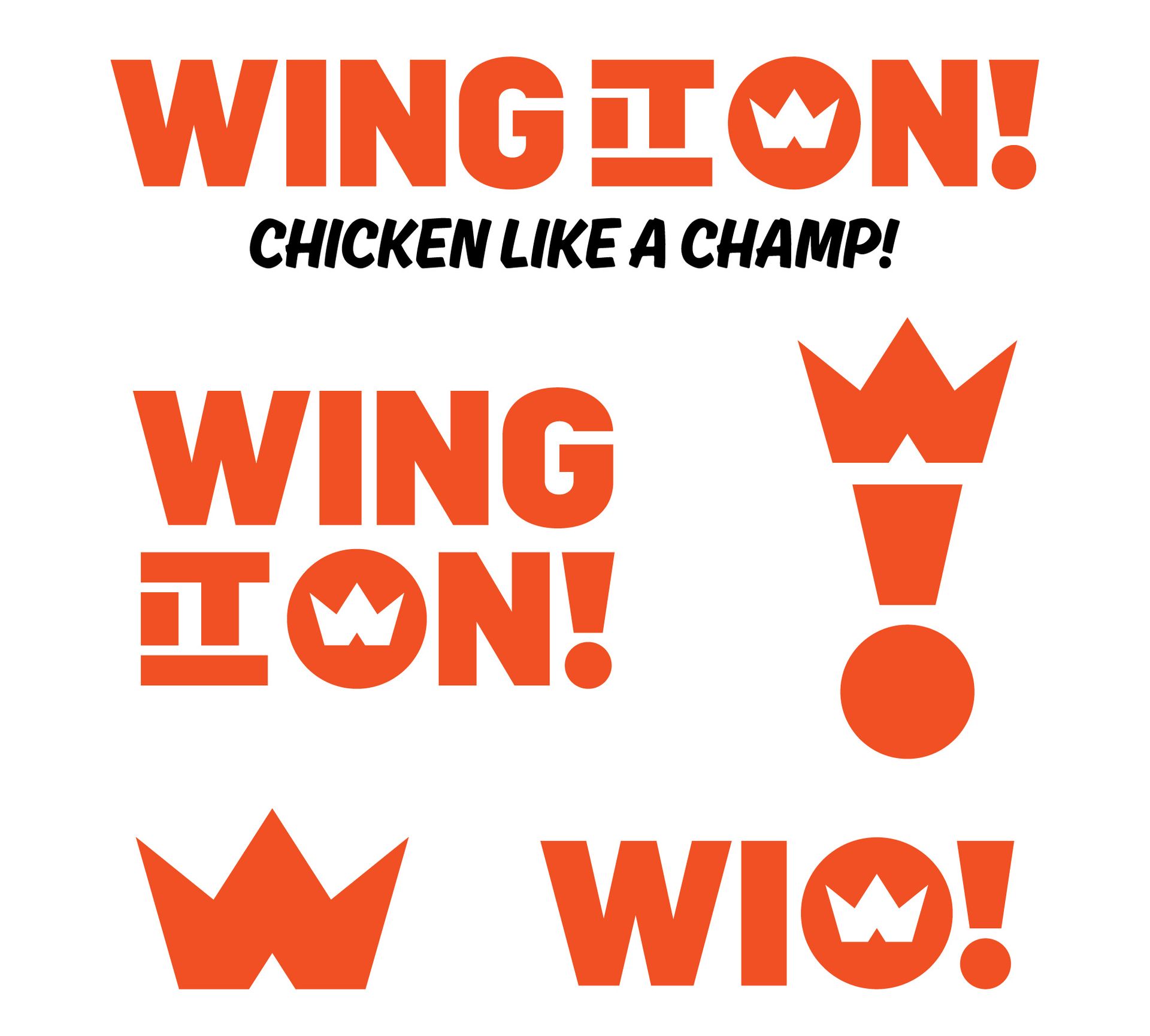
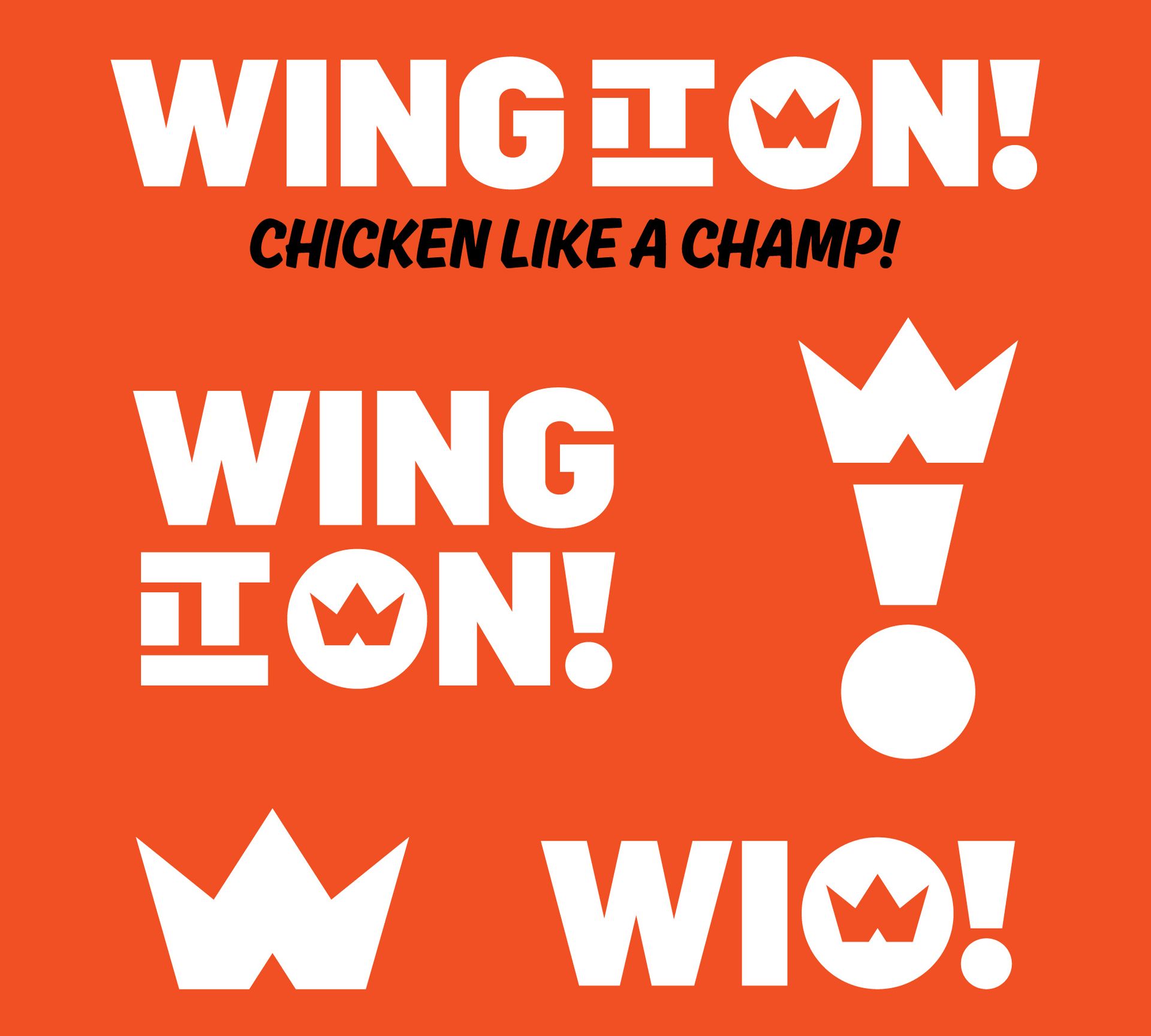
Orange WING IT ON! chicken logo variations on white background, with crown, exclamation mark, and tagline.
Orange Wing it on logo with white text and crown icons, plus the slogan “Chicken like a champ!”

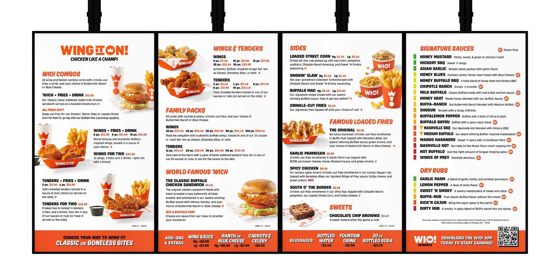
Digital Menus

Orange-and-white restaurant menu flyer with wing combo photos and pricing details

Product Branding

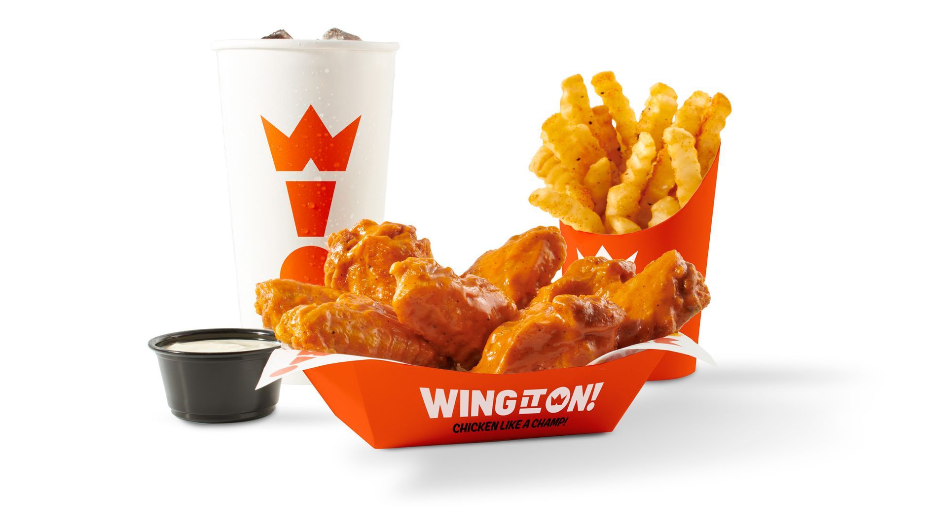
Wing It On chicken tenders, fries, and dipping sauce with a drink on a white background
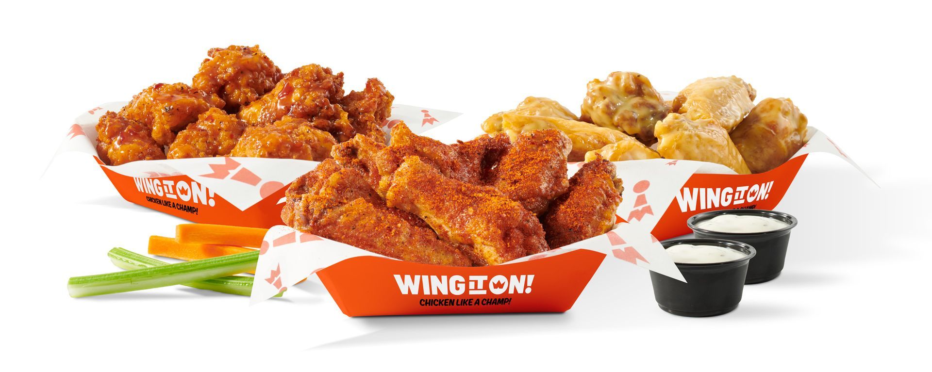
Orange-glazed chicken wings in Wing It On! baskets with celery and dipping sauce on a white background

Patterns

Orange Wing It On icons scattered on a white background, like a repeating pattern.
Orange background with scattered small carrot illustrations in yellow and red for Wing It On

Event Marketing

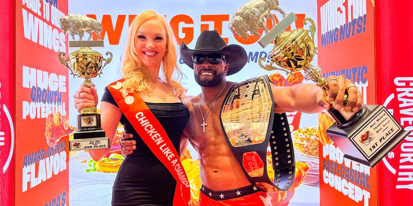
Two people pose with championship belts at a red carpet event, smiling and holding trophies for Wing It On